Clearwater Pharmacy - Brand Design
As a local business, there were a lot of creative opportunities to explore. We wanted to stay true to the locals/older demographic in the area, while appealing to the younger demographic to feel fresh and modern.
The solution? Lean all the way into the local, tropical aesthetic and redefine how a pharmacy can show up visually.
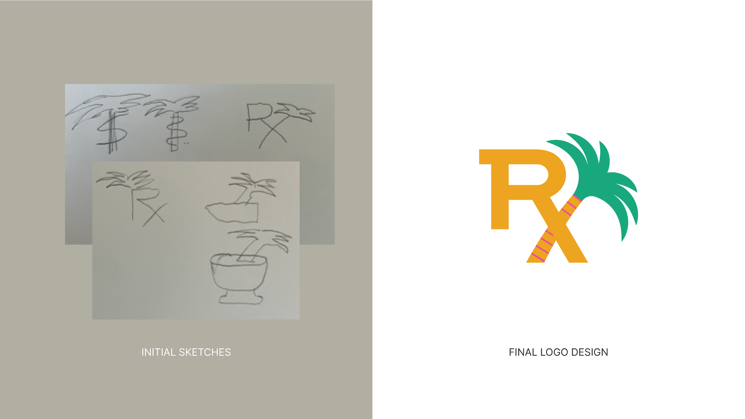
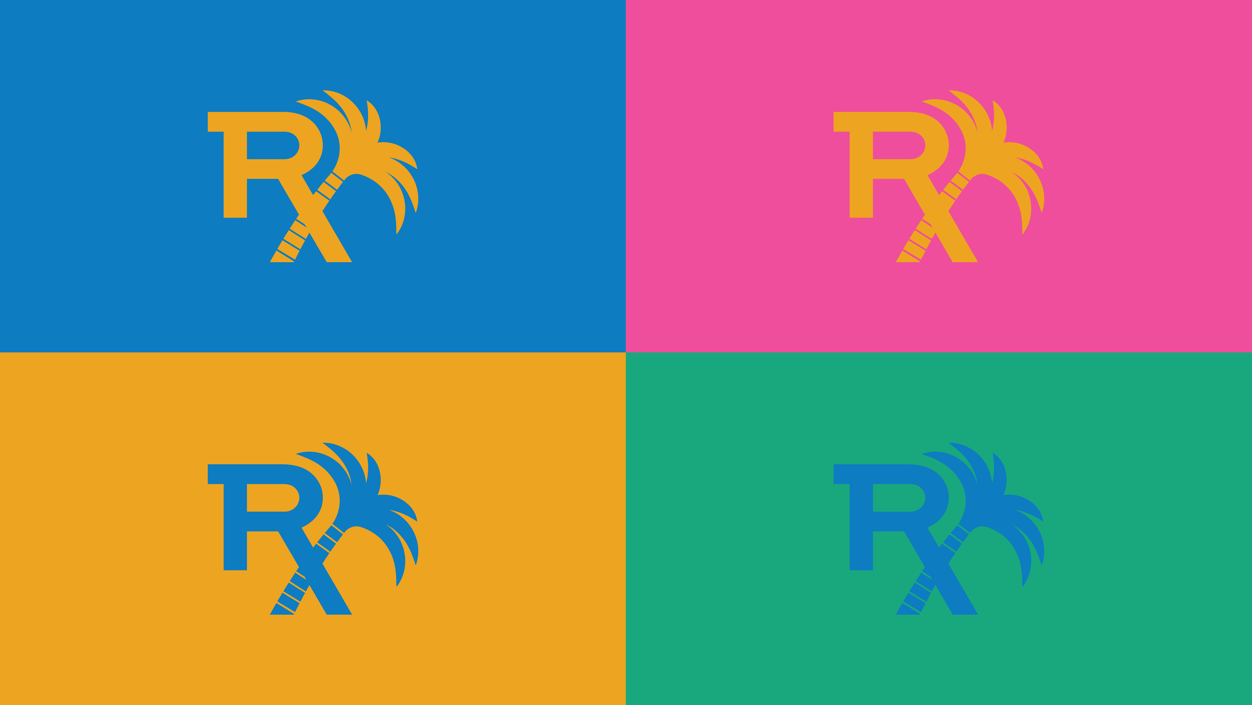
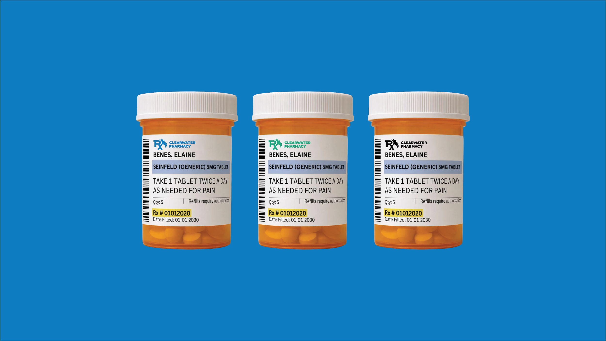
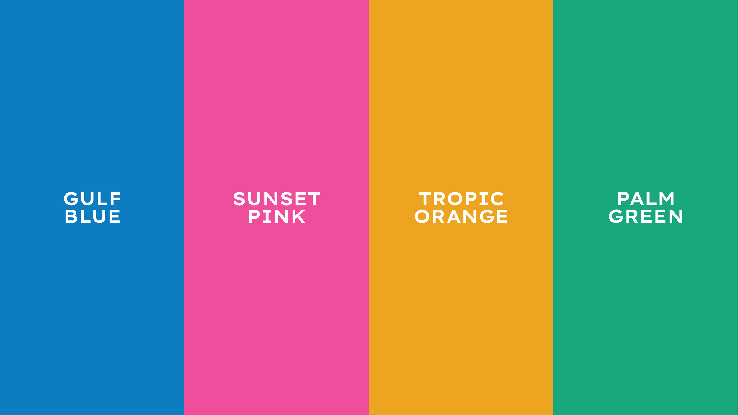
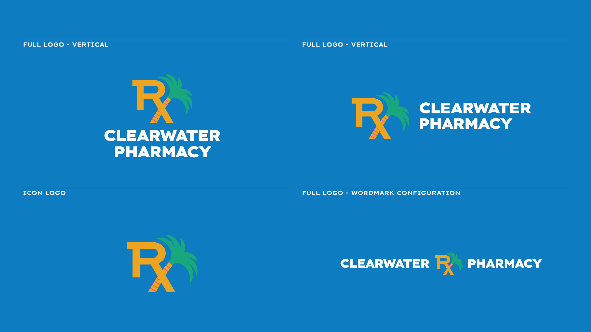
The logo takes the prescription symbol and stylizes it with a palm tree. The resulting mark is instantly distinct while being easy to scale across a wide variety of applications. Paired with a beachy, sunset-driven color palette, the overall brand system is one that’s hard to forget.